



A carousel suits a product explanation when a shopper needs to resolve several connected questions before choosing. Use one image when one view and one short answer settle the question. For Instagram carousel product education, give each slide a distinct decision, such as what fits, how it opens, or which version suits a particular routine. Choose the format for that explanation, without assuming extra slides will earn extra reach.
Decide whether the explanation needs a sequence
Write the buyer's question before opening a design tool. "Meet our new bag" describes an announcement. "Which bag works for a commute with a laptop and lunch?" gives the post a job.
Then list the facts needed to answer it. A carousel is worth drafting when the facts need separate views, yet still lead to the same choice. If every proposed slide repeats the same benefit with another photograph, try one image instead.
| What the shopper needs | Recommended format | Reason |
|---|---|---|
| Recognize a new color | One image | A clear product view can answer the question. |
| Compare two versions across several daily needs | Carousel | Each view can resolve a different tradeoff. |
| Understand how a moving mechanism works | Video demonstration | The movement itself carries the explanation. |
| Check a long compatibility list | Product page or reference guide | The reader needs complete, maintained detail. |
These are editorial recommendations, not Instagram requirements. A carousel can also include video. Instagram's carousel Help Center page, read on September 28, 2026, describes posts containing up to 20 photos and videos. That limit is capacity, not a target length. Stop when the shopper has the answer.
If the explanation depends on motion, use the guide to making an Instagram product Reel understandable without sound to plan the demonstration. For a campaign mixing several formats, choose Instagram formats around the campaign's viewing needs.
Give each slide one decision
A useful slide contains a question, visible evidence and a consequence for the buyer. For example, a photograph of an open pocket becomes useful when it shows whether the object a buyer carries fits inside.
Keep the two products in the same positions across comparison slides. Use the same camera angle and comparable lighting where possible. A larger photograph should not make the smaller product seem larger. Name the products on every comparison slide so readers do not need to remember an earlier key.
Later's carousel article suggests using the format for product variations, details and recommendations. That is a useful starting point. Turn the broad topic into a specific buyer choice before laying out the slides.
"One decision per slide" is a writing rule for this storyboard. It is not a rule from Instagram, a tested optimum, or a claim about ranking.
A seven-slide hypothetical bag comparison
The following storyboard is hypothetical. The products, features and suggested copy are invented to demonstrate the method. They describe no real inventory or measured customer outcome. For a real post, replace every product detail with checked specifications and photographs of the actual item.
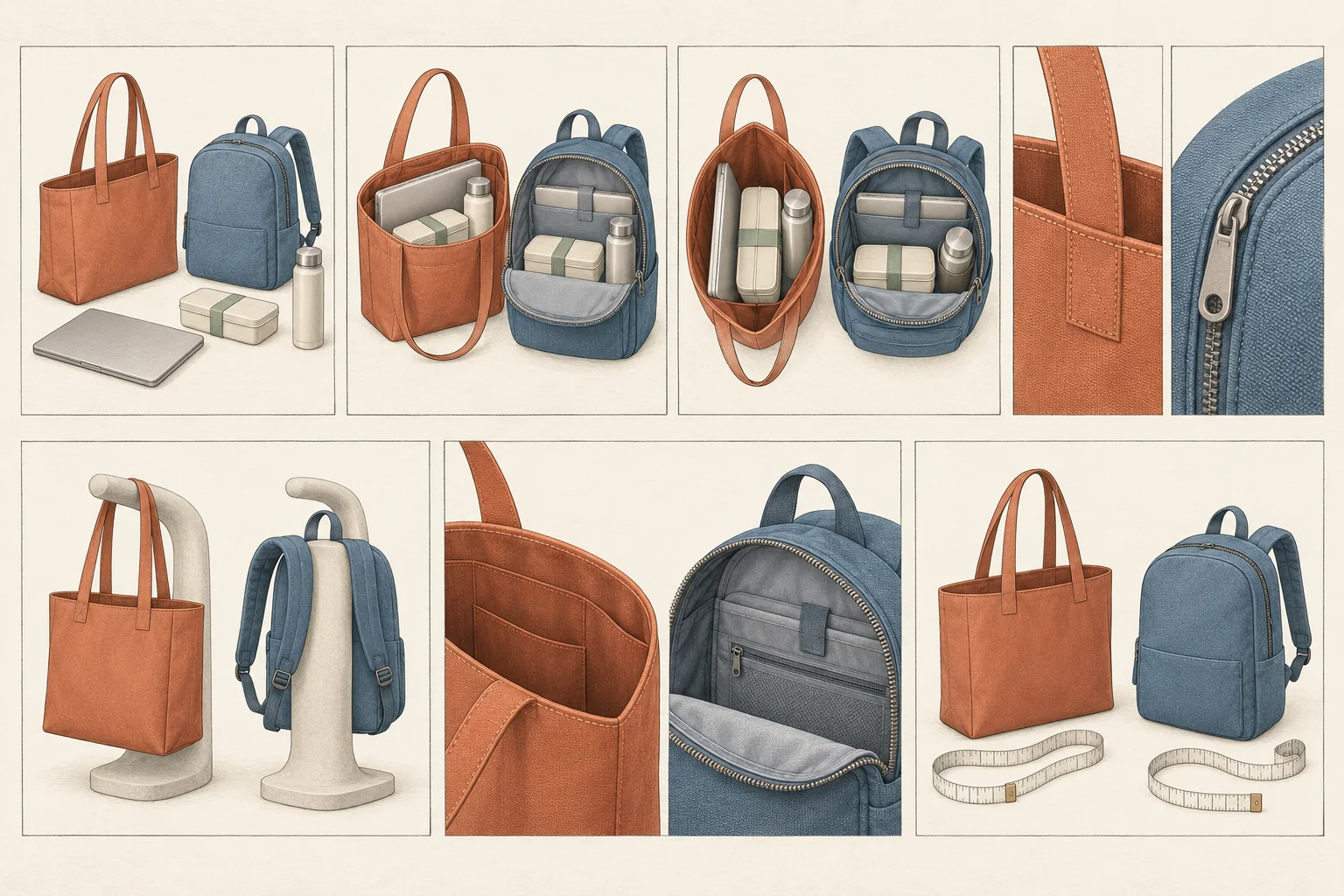
Imagine comparing an Open Tote with a Zip Backpack for a commute. In this example, the tote has an open top and shoulder handles. The backpack has a zip closure and two shoulder straps. Both need honest capacity and fit demonstrations.
| Slide | Decision | Visual evidence to prepare | Suggested copy |
|---|---|---|---|
| 1 | Which carrying style suits the trip? | Both bags beside the same workday essentials. | "Open Tote or Zip Backpack? Compare access, fit and carrying style for your commute." |
| 2 | Does the daily load fit? | Each bag packed with the same laptop, lunch container and bottle, with contents visible. | "Start with what you carry. Compare the same load in both bags." |
| 3 | How do you want to reach items? | Openings photographed from above, with keys in their intended place. | "The tote stays open. The backpack needs unzipping. Which opening suits your stops?" |
| 4 | Do you want a closure? | Tote opening and backpack zipper shown in close-up. | "Choose an open top or a zip closure. Neither view proves protection from rain." |
| 5 | How do you want to carry it? | Both bags on the same neutral mannequin, loaded consistently. | "Compare shoulder handles with two backpack straps. Check strap fit before choosing." |
| 6 | Which compromise can you accept? | Paired detail crops showing the tote opening and backpack zipper. | "Tote: direct access, no top closure. Backpack: zip closure, an extra step to reach inside." |
| 7 | What must you check before ordering? | Both products beside a measuring tape and the same packed essentials. | "Check internal dimensions, strap fit and care instructions on the product page before ordering." |
Seven slides serve this example because each advances the comparison. A real product may need fewer. If access and closure are effectively the same buying question for your audience, combine those slides.
The first slide names the choice rather than hiding it behind a vague reveal. The middle slides show comparable evidence. The last slide directs the reader to checks that a photograph cannot settle.
Avoid adding unsupported comfort, durability or weather-resistance claims to fill the layout. A strap photograph shows construction and placement. It does not prove how a loaded bag will feel after a long walk. A closed zipper does not establish waterproofing.
Keep the caption and product page consistent
Use the caption to summarize the main tradeoff and state any conditions that affect the comparison. For the hypothetical bags, that includes the fact that both demonstrations used the same contents. In a real comparison, identify the tested product versions and anything shown that is sold separately.
Instagram's computer publishing instructions describe one caption for the whole carousel. Make that caption support the complete choice instead of repeating only the cover. Keep a material limitation beside the claim it qualifies on the slide too. Do not make the shopper search elsewhere for the condition that changes its meaning.
Before sending people onward, make the landing page match the promised product. Product names, pictured versions and the destination's specifications should agree.
Review comprehension before reach
Ask someone unfamiliar with the product to read the draft on a phone. Have them explain which version they would choose and what tradeoff they would accept. If their answer depends on a feature the post never established, revise the slide that invited that assumption.
Check these points before publication:
- Each slide resolves a different question or earns its place with necessary evidence.
- Product labels remain clear without remembering the previous slide.
- The comparison uses matching conditions and does not conceal an unfavorable detail.
- Text and important product details remain readable in the planned crop.
- The final instruction points to information the destination contains.
Keep performance interpretation separate from this review. Instagram's 2023 ranking explanation describes personalized Feed ranking using many signals, including activity, post information and interaction history. It also says signals change over time. That explanation does not establish that a seven-slide comparison will outrank a single image.
Instagram's Help Center also says likes and comments apply to the entire carousel. Those totals cannot tell you whether the shopper understood the closure comparison on slide four. Use observed reader confusion to improve the explanation rather than treating every interaction as proof of comprehension.
For your next product post, write the buyer's question and sketch only the views needed to answer it. If one image answers it fully, publish one image. If several connected decisions remain, turn those decisions into the carousel.